 icon.
icon. and select Dashboard.
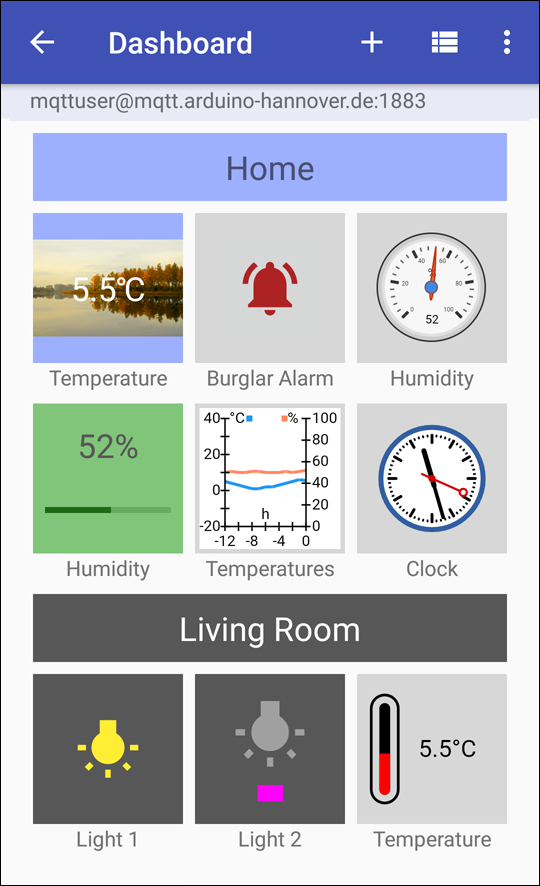
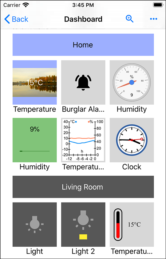
In addition to the “Messages” view the app offers a “Dashboard” view with graphical user interface. It allows creating display and control elements (so-called “dashes”), e.g. temperature display, light control switches, alarms, and more.
icon. and select Dashboard.Immediately after selecting a list entry of a push server account, you are taken to
either the “Dashboard” or “Messages” view. This depends on what you had selected last.
You can switch to the other view by tapping on the  or icon in the navigation bar.
and selecting Messages or Dashboard.
or icon in the navigation bar.
and selecting Messages or Dashboard.
Now you are in the “Dashboard“ mode.
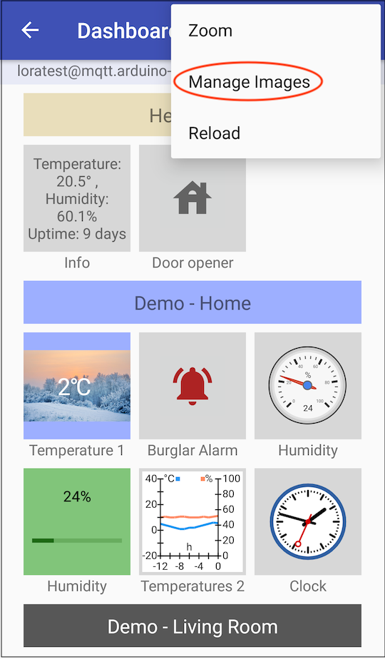
 icon.Again tap on the icon and select the Edit Dashboard
entry.
icon.Again tap on the icon and select the Edit Dashboard
entry. icon.
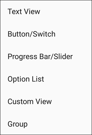
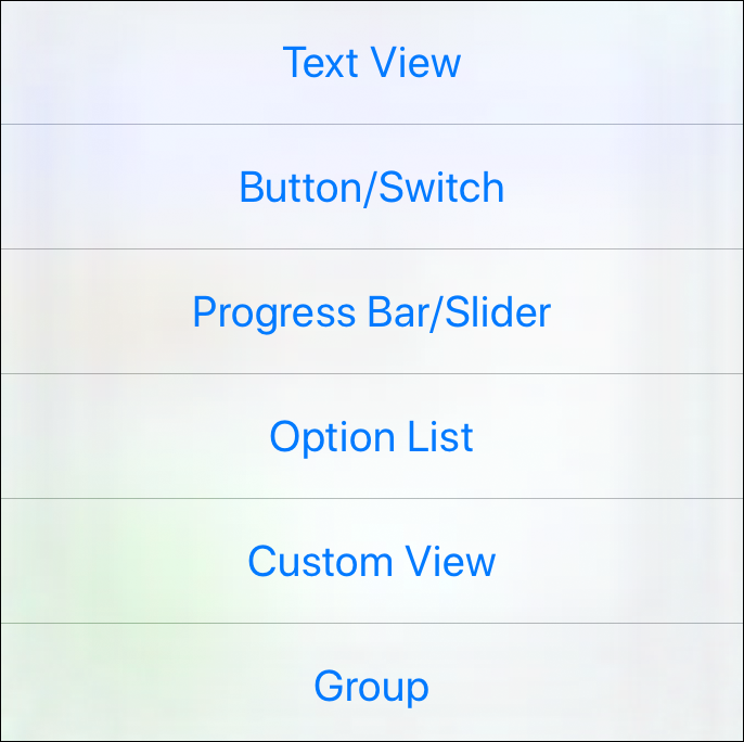
icon.A pop-up menu provides several dash templates for various purposes, which offer a good base for creating own solutions.
| Dash | Explanation |
|---|---|
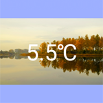
| Text View | Allows displaying messages in text form and entering values. See the Text View section |
| Button/Switch | Creates a button or a switch. See the Button/Switch section |
| Progress Bar/Slider | Represents a value range by a bar. If a “Publish Topic” is specified, a new value can be set and sent using a slider. See the Progress Bar/Slider section |
| Option List | Allows the definition of any set of values. See the Option List section |
| Custom View | Allows creating new dashes in HTML. See the Custom View section |
| Group | Allows grouping dash tiles. See the Group section |
Represents the content of a message in text form. If a “Publish Topic” has been specified, a value can be entered and sent in the detail view.

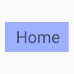
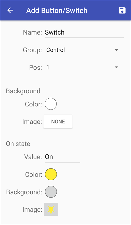
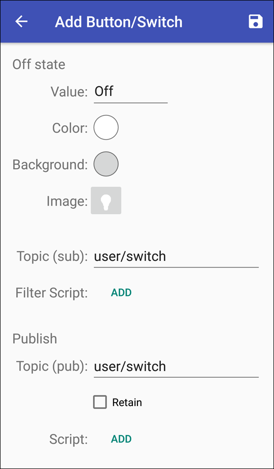
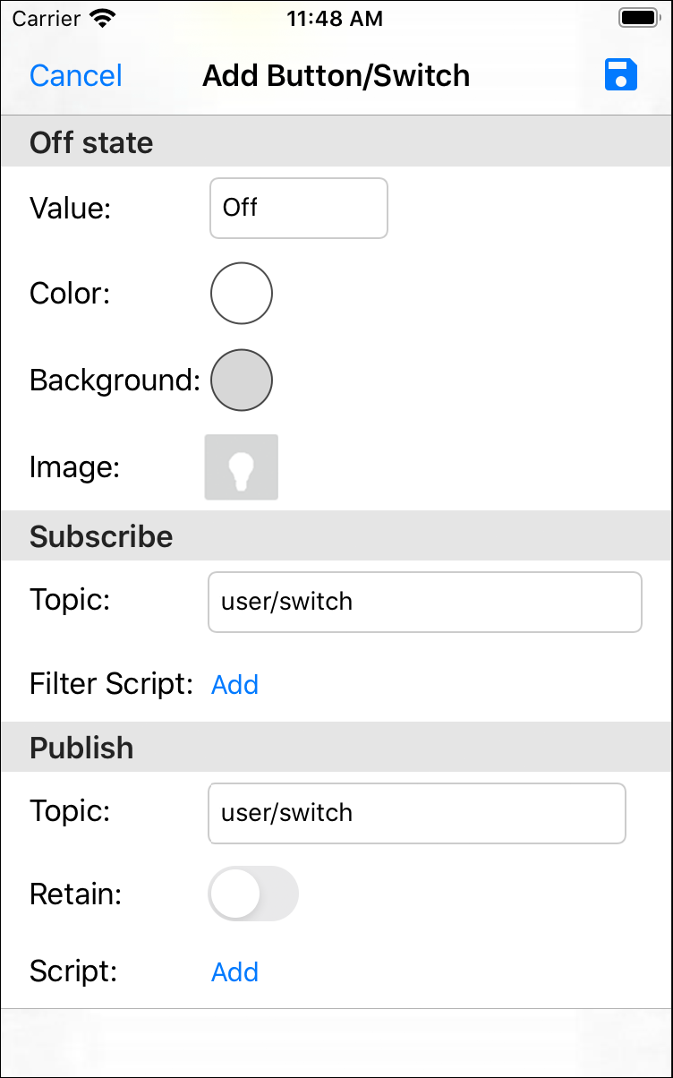
Generates a button element which works e.g. as a push button which sends a message upon tapping. For this, the “Off state” fields remains blank. If the button is created as a switch that changes its state (on/off) depending on the value of the last received message, a topic must be entered in “Off state”. This could be used to control an alarm system, for example. Another example of a dash that switches a light on and off, and informs about the current switching status at the same time, can be found here.
* If used as a switch with status request, otherwise optional
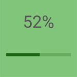
A value range is represented by a bar, with the bar being colored up to the current value (like a progress bar). If a “Publish Topic” has been specified, a new value can be set and sent in the detail view using a slider.
* If used as a slider for transmitting values, otherwise optional

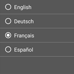
Allows the definition of a set of values. A display value can be defined for each option, which is shown instead of the actual value.
For a better overview in the dashboard, groups can be created to which individual dashes can be assigned. These could be, for example, logical group subdivisions: cellar, ground floor, upper floor, garden house, etc.
Individual dashes can be grouped or assigned to another group. For
this, tap and hold the desired dash tile (“Long Press”) until the  symbol appears in the tile.
Then press
symbol appears in the tile.
Then press  to open the dash
tile editor.
to open the dash
tile editor.
Individual dashes can be grouped or assigned to another group. For
this, tap on and select Edit Dashboard. Then, tap on the desired tiles (the symbol appears in the tile) and press
 to open the dash tile editor.
“Custom View” corresponds to a standard browser window, which can be
used to create individual interfaces and operating elements. This allows
you to create any dashes in HTML. The HTML can contain additional JavaScript
code to program dashes with individual logic.
An application programming interface (API) can be used to receive
MQTT messages, query settings and access resources such as imported images (see
Dashboard Scripts).
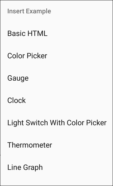
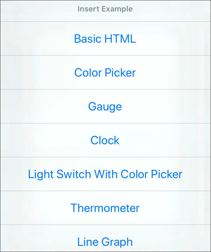
Alternatively, by tapping the overflow menu ( ) under “Insert Example”and selecting Insert Example, you can get seven
different HTML templates (Basic HTML, Color Picker,
Gauge, Clock, Light Switch with Color Picker,
Thermometer and Line Graph) that can be inserted and
edited directly in the dash.
) under “Insert Example”and selecting Insert Example, you can get seven
different HTML templates (Basic HTML, Color Picker,
Gauge, Clock, Light Switch with Color Picker,
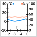
Thermometer and Line Graph) that can be inserted and
edited directly in the dash.
Advanced knowledge of HTML and JavaScript is required to create a Custom View. Some examples use HTML5 and may not run on older mobile devices. In the examples where received message data is processed, the code must be adapted according to the data structure of the message content. See Custom View HTML.
Keep the size of your message content small! Messages larger than 256 kB will be ignored and not delivered as a push message. If the content of a push notification is larger than 255 bytes, it will always be truncated.
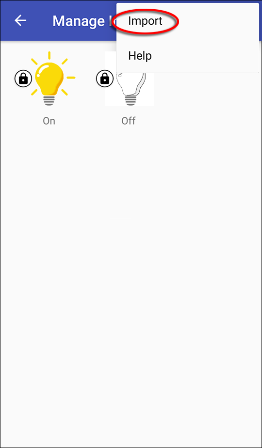
Some dashes allow the integration of images (backgrounds, status of switches, etc.). In order for your own pictures to be available in the app, they must first be imported into the app:
).
)
again, tap on “Import”Import
and select those images that you would like to import into the app.All images that were imported into the app are shown in the “Manage Images” window:
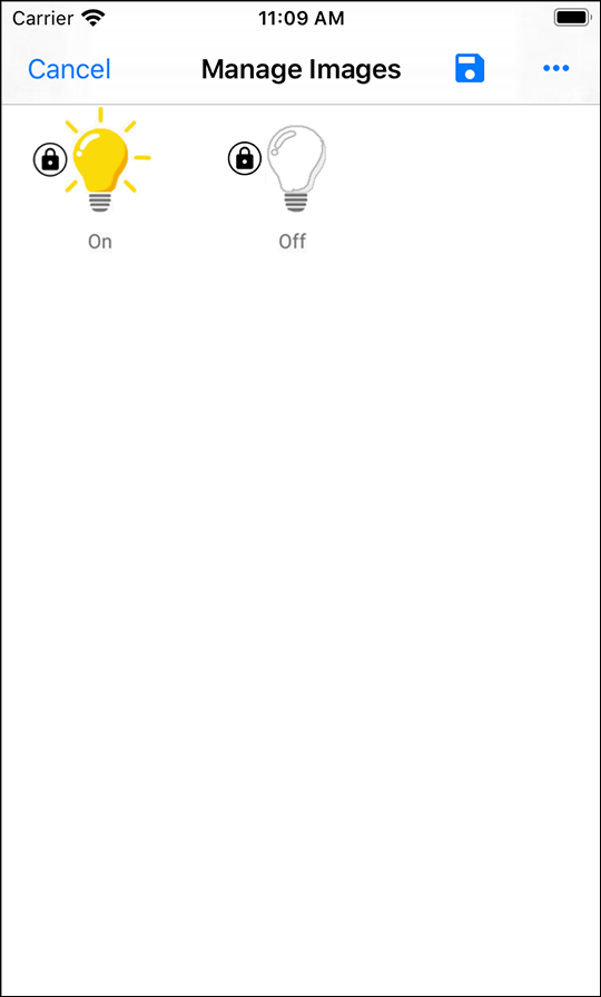
When exiting the app, images that are not used in any dash are deleted.
The same applies to images that are referenced exclusively in the script
code. To prevent this, they can be protected. In the picture above you
can already see two previously imported pictures.
Both are marked with such a protection ( ).
).
appears., select Edit
and tap on the desired image file.Those images marked with a , as well as images that have been explicitly selected
as background image or label for the Button/Switch or
Option List dashes, will be retained when the app is restarted.
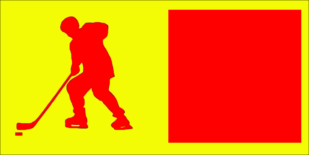
If images containing transparencies are included in the dash via the “Image” field, these transparencies are preserved. The following figure shows the comparison between an image with (left) and one without transparencies (right). Both images are placed on a yellow background:
Images that are used in buttons can be colorized. Images without transparency would be colorized completely with the selected color. The following figure is based on the previous one, but has an additional red coloration of the foreground:
Let's configure a dash, which switches a light on and off and at the same time informs about the current switching status.
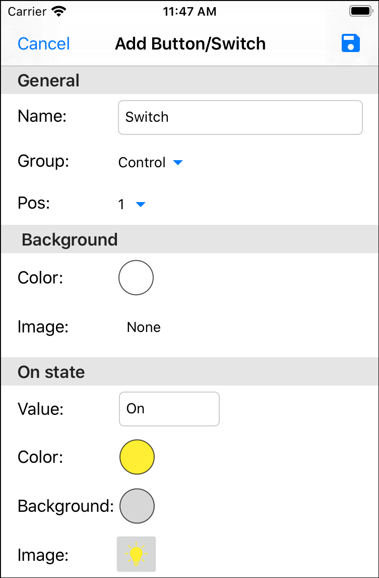
An image can also be used in addition to a background color:
The “Select an Image” window provides a number of icons and symbols. Alternatively, you can also use your own images that you have previously imported into the app (see Import own images into the app).
 to save your entries/changes.
Only in this way the dash can query the switch status (“Topic (sub)”in the “Subscribe” section) from the server and send switch commands to the server (“Topic (pub)”in the “Publish” section).